If you're building an app or thinking about it, then it's highly likely that you want to give a "great" user experience so that people will use your app and keep coming back. The thing is, creating a great user experience is harder than you'd think, and business people fall into the trap of investing in the wrong areas, resulting in poor UX and blown budgets.
This article aims to give you a broader perspective on the user experience and help you understand where to invest your budget. You might be surprised at where we end up.
Why user experience helps growth
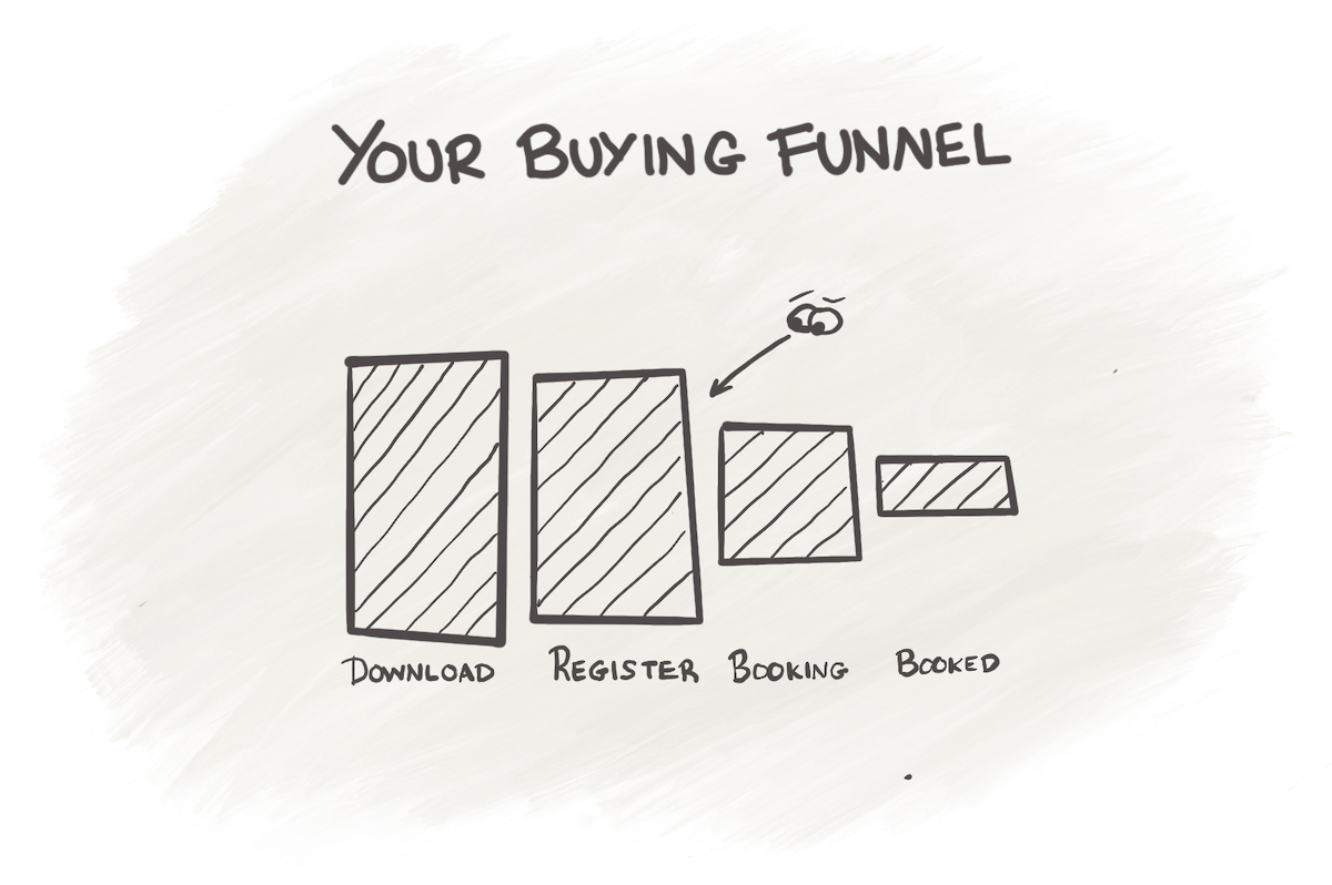
Imagine your app is a sales funnel full of obstacles that could cause a customer to leave. What might those obstacles be?

- Your app isn't solving a problem they actually have, so they don't download it
- Users don't understand what your app can do for them, so they don't have the motivation to use it
- They don't find your "offer" very persuasive so don't buy
- Users find it hard to achieve a given task in your app, so they give up
- They experience bugs, so they get frustrated and abandon ship
- They have your app but never developed the habit if using it regularly
All these things either:
- Prevent people from downloading in the first place
- Prevent people from buying, booking or spending money
- Discourage people from returning to your app
- Discourage people from speaking positively about your app
Unless you solve all these problems, you're going to have issues with growth. People are going to fall out of your sales funnel, and that will stifle growth. According to uxdesign.cc, mobile apps that provide a seamless and intuitive user experience have higher conversion rates.
How to overcome growth-related problems with UX
The thing is, all of the above problems can be helped in some way or another by investing in user experience. A user experience professional or team will not just be able to design your app, but they can also:
- Analyse if your ideas are appealing to customers
- Identify and remove obstacles in the user experience
- Design mechanisms that keep people coming back
- Design mechanisms that create organic referrals
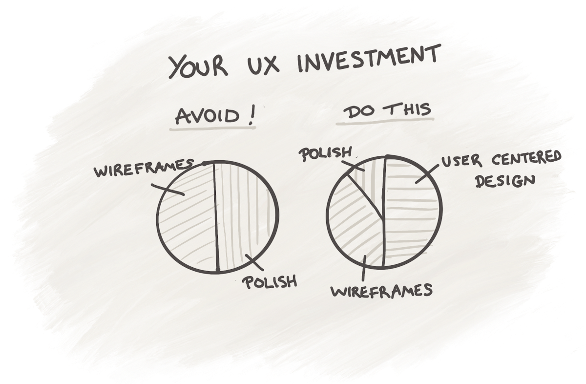
All you have to do is make sure you ask for their help with these things. You have to be open to investing in more than having your ideas drawn up and polished.
If you need more convincing that this stuff is important, check out these horrendous statistics:
- Nearly 80% of users will abandon an app if it takes too long to load
- Around 90% of users will stop using an app if it crashes frequently
- Over 50% of users will not recommend an app if they have a poor experience with it.
With that out of the way, let's go on to look more closely at how you should invest in your UX and why, starting with a common pitfall: the slick user experience trap.
Start by avoiding the slick-user-experience trap
Here's a question for you, if I may. What does a "great" user experience look like for your app?
Most people say something like this:
- It feels slick and easy to use
- It looks modern, fresh and on-brand
- It delights people
If you said anything like this, you'd be 100% right; all these things contribute towards a great user experience.
So, the next question is, how do we get your app to have this great user experience?
In my experience, what most people do when they build an app is invest in a process like this.
- Make a list of what we want customers to be able to do with the app. E.g., login, pick a restaurant and order some food, cancel the order, rate an order, etc
- Have a designer create app wireframes so we can imagine ourselves using the app and see if it feels logical and simple
- Review those wireframes and tweak them so that it make sense to you, the business expert
- Have a designer create a beautiful design to make those wireframes look modern and on-brand
- At this point, you're now ready to get the app developed
The above activities are all good and fall under the umbrella of user experience.
The problem is, if you do this, you'll find yourself in the slick user experience trap. You did all the obvious things to create a logical and beautiful app, but you failed to do many of the really important things that lead to a great user experience and app growth.
Next, let's look at what they are.
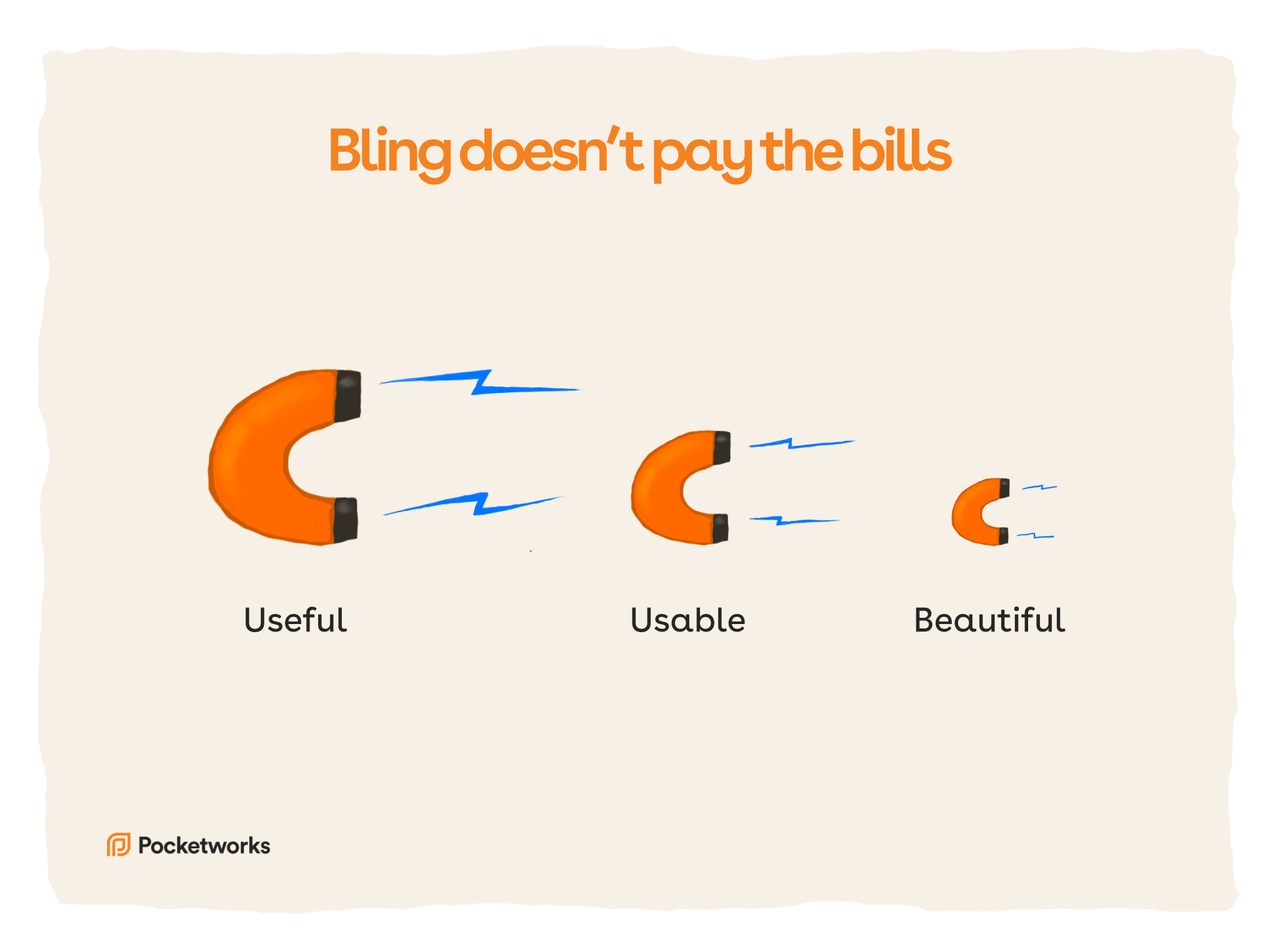
Invest in useful, not beautiful
In our Badly Drawn Mobile book, we discuss how it's easy to get your priorities wrong when approaching the UX for your app. I've met many app founders and business leaders who put too much budget into polished design, only to launch an app that customers don't find useful.

The problem is, how can you find out if your app is truly useful to customers without building it?
Luckily, you can invest in different activities to figure out if your app is actually useful.
- Testing your prototypes and wireframes on real customers
- Testing an app landing web page on users
- Interviewing users and asking them questions
- Running focus groups
All these activities can help you understand if you're doing something your target audience will find useful. The good news is that many UX designers have the skills to do any of these tasks or can introduce you to people who have those skills.
So, invest in bling later and focus on being useful to start with.
The customer's perception is your reality.
- Kate Zabriskie


